This is the editing and development for the tourism add project
Font development: BY GUSDE
At first Gusde researched horror movie fonts as they appealed to our target audience and are apart of the same genre.
What i took away front this is that a prominent feature is the red color which Gusde figured is due to the relation to blood and gore as well as the red color invoke anger and strong volatile emotions closely linked with fear. Though Gusde thought these fonts didn't fit our advertisement as we wanted more of a traditional and cultural text.

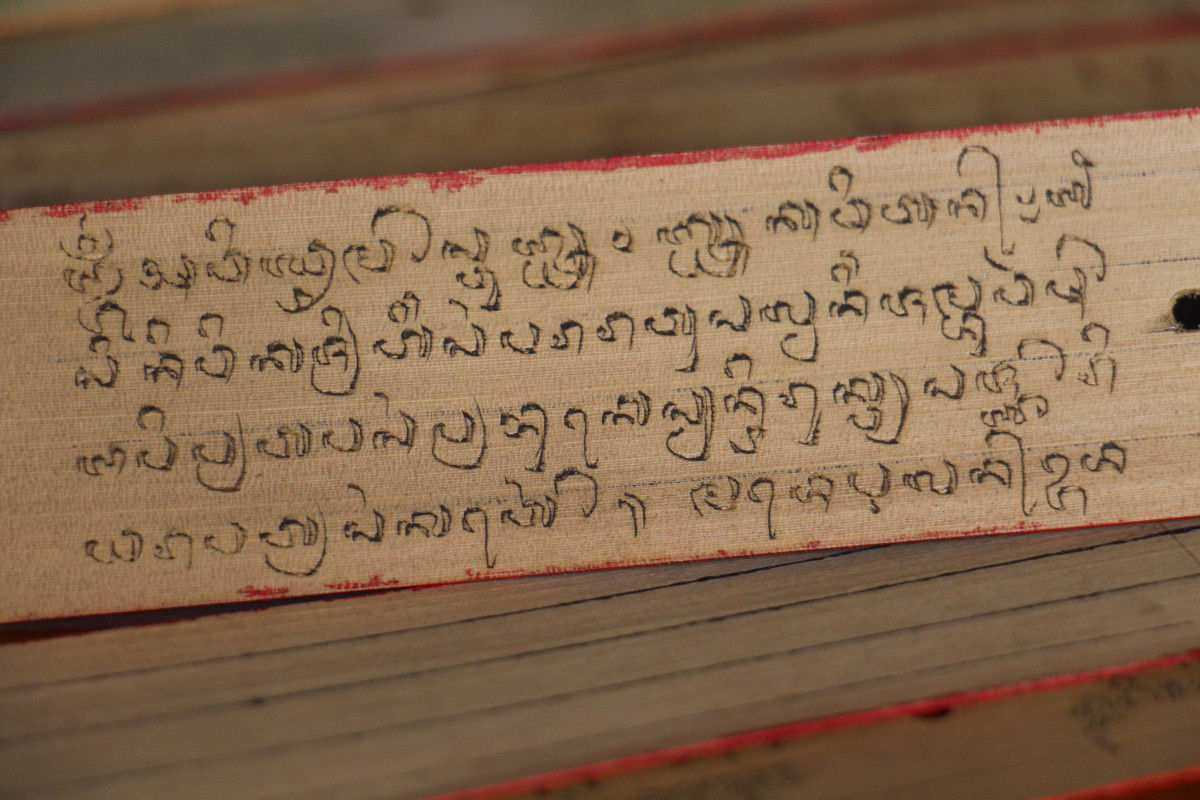
An the end for the font of the font we wanted to go with a font inspired by the traditional balinese text/alphabet called Askara bali after searching around we discovered a font called balinese family font.
so maha used colour grading to change the colour of the sunset and the surrounding to make it more attractive and make the people want to watch the ad for a longer time.
so maha added a glitch sound and a light switch off sound to make it more attractive also the glitch will suit it because there is an error in the video in the scene 2 where there is on and off light switch.
So Maha put a happy song in the first combine with the sunset, but then there is a blackscreen with a off switch sound and goes to the horror side of Bali at first we dont think about the black screen and light switch but then we put it in the video and made it more better and more pamper.
REFLECTION: By having this blog it helps us to make our editing better and to decide the fonts for our texts in the advert and it can make the video look nicer


.jpeg)
.jpeg)

Tidak ada komentar:
Posting Komentar